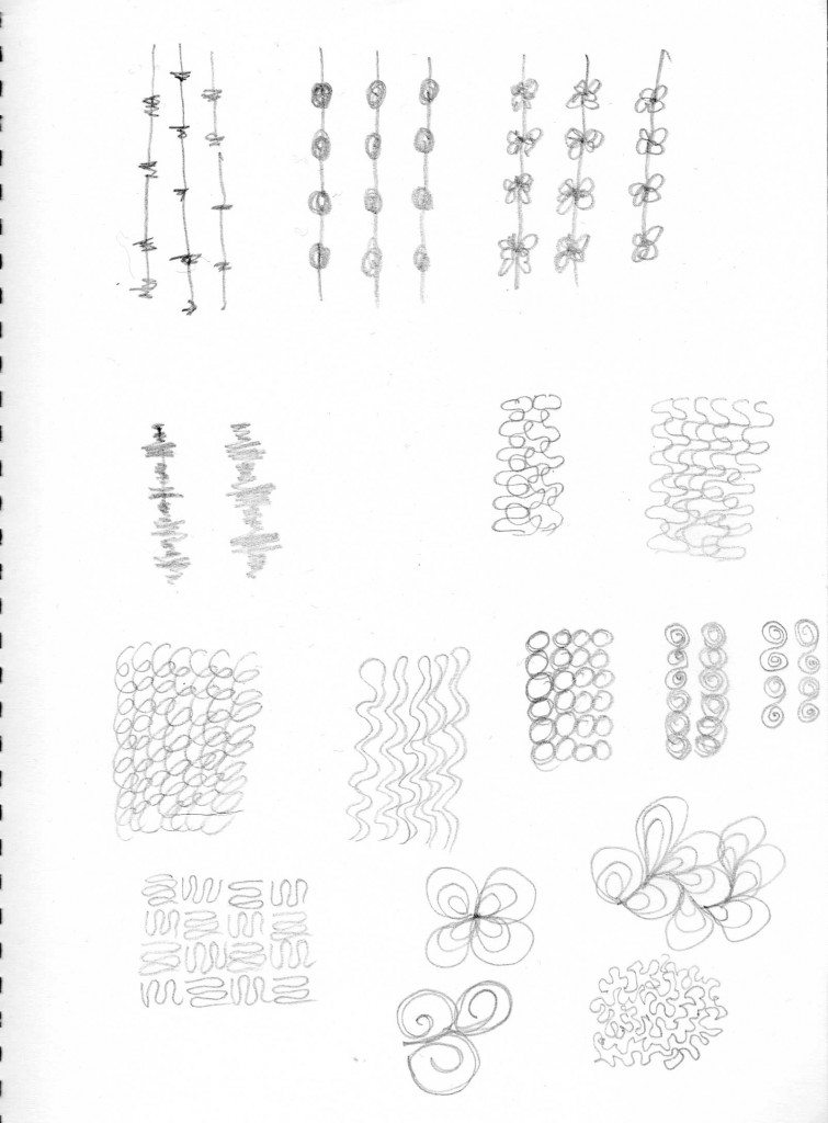
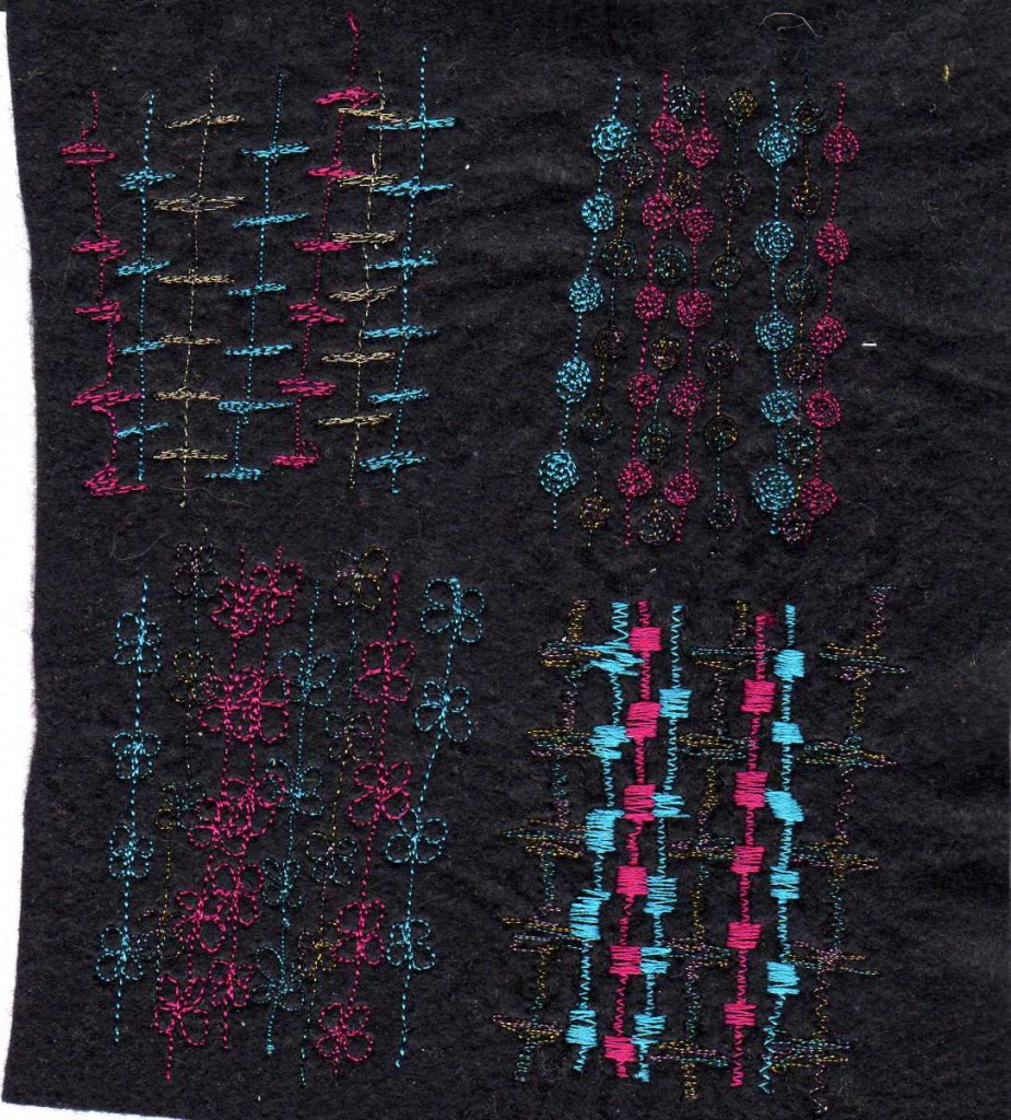
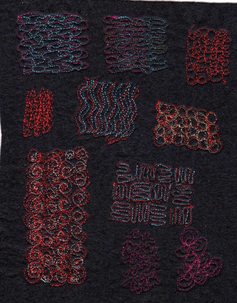
I really enjoyed doing these samples and feel a lot more confident that I can make the machine stitch where I want to go. Not yet perfect, but better!
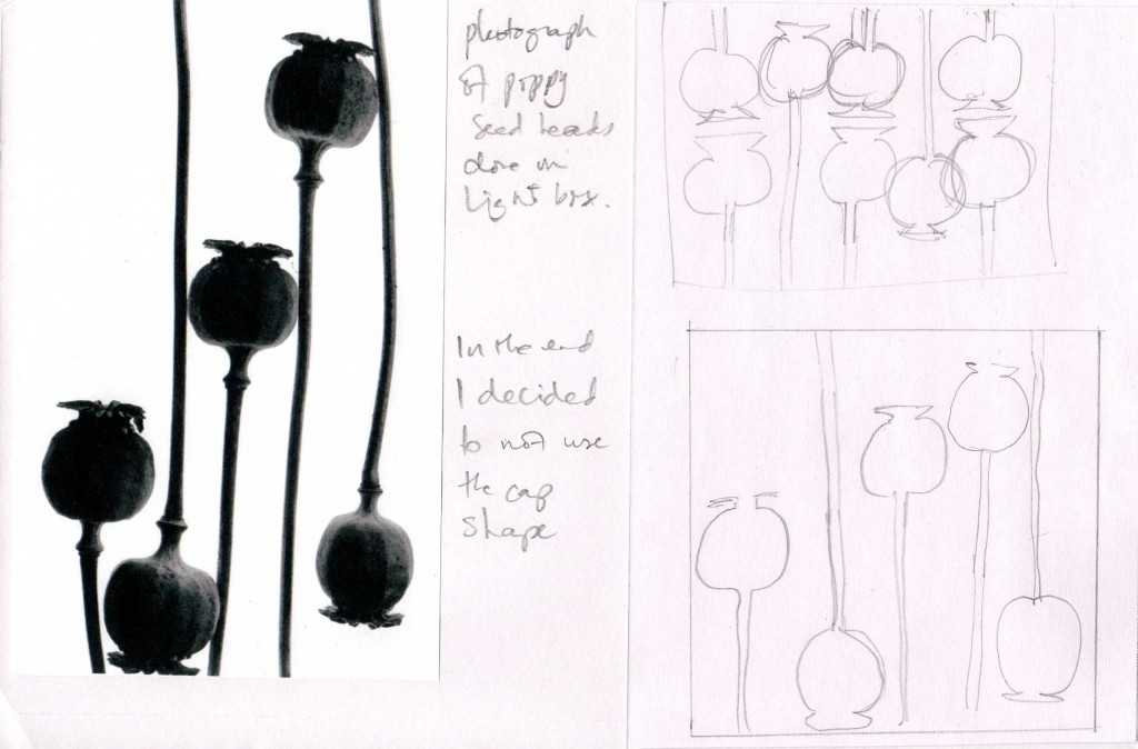
I found this old photo of mine and thought it had possibilities, but after a couple of drawings I simplified it into the design below.
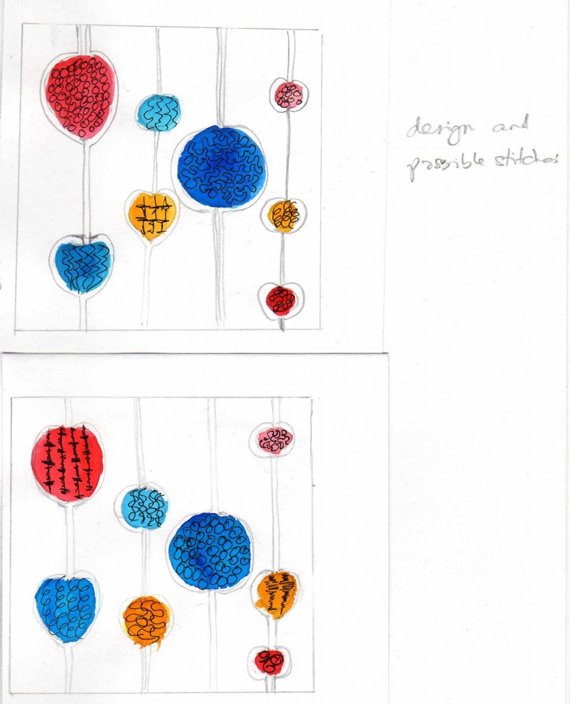
I wasn’t totally satisfied with the stitch samples I chose for the top image, more so with the second.
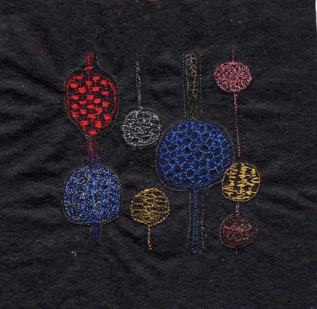
I used a very dark blue to start with and then because it didn’t seem to show up very well, I went over the stitching with a slightly lighter blue. I’ve used gold thread in some places.
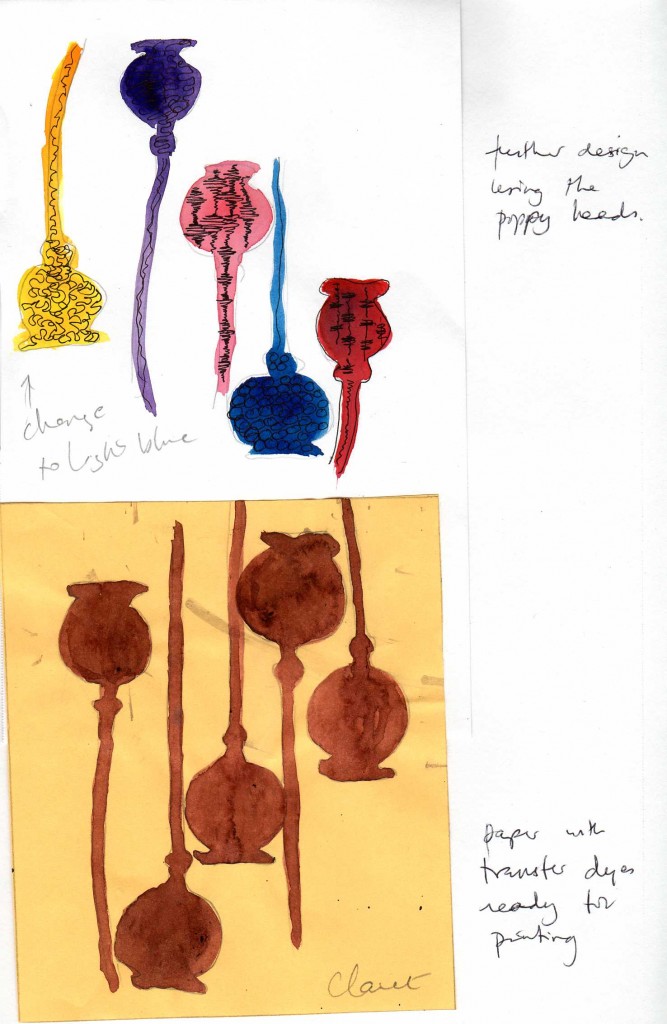
I decided to take the poppy seed heads as an actual image and work with that.
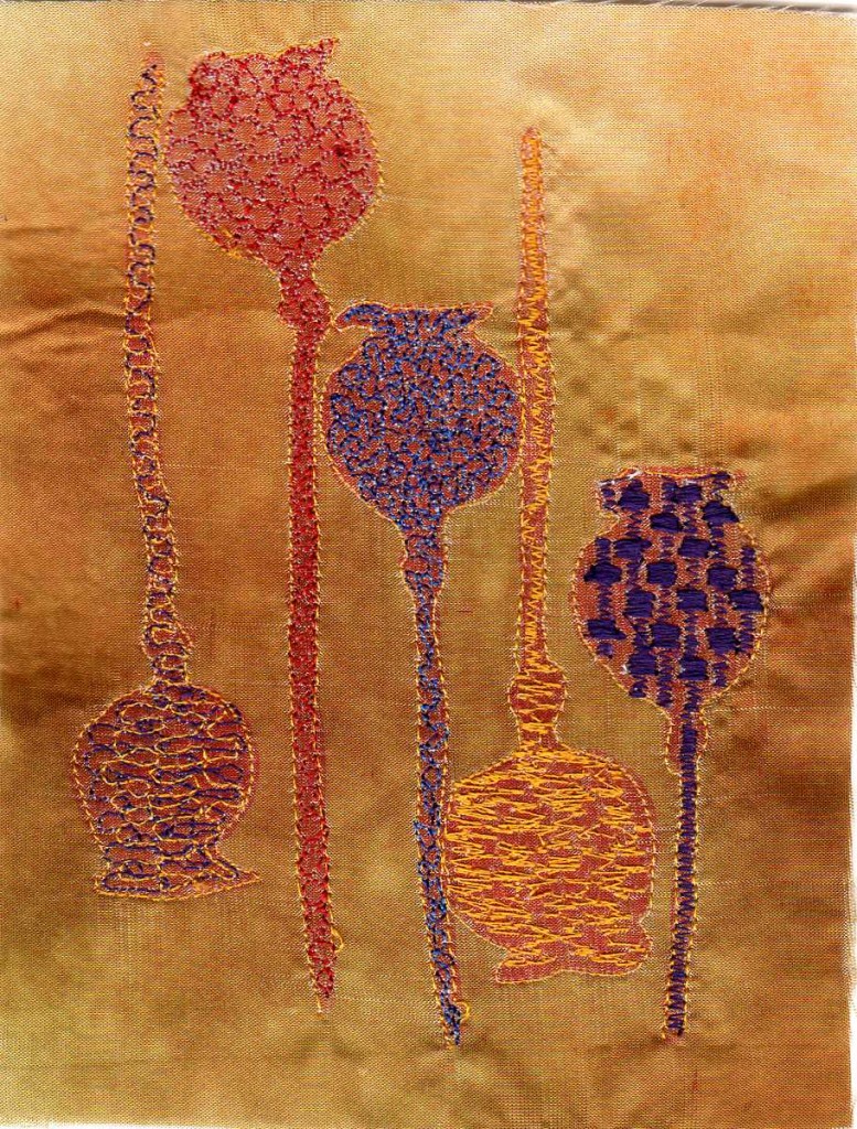
When I came to stitch, I re-positioned the colours as I preferred them this way. I dyed the satin brown, before printing with claret dye the image I had painted on to paper. This sample has a warm tone to itand is fairly muted in effect. The threads are yellow, purple, red and blue, with each outline done in yellow.
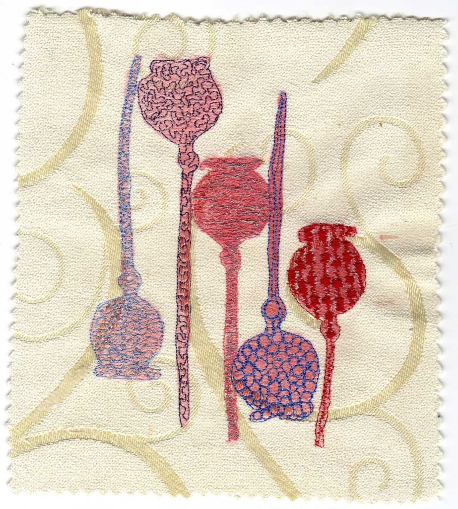
For this sample I printed on to a furnishing fabric remnant. I thought the rounded shapes in the fabric would make an interesting background to the image. I discarded the yellow colour . I know the effect is very subtle with the colours I have used – red, pink, blue, pale blue and purple with silver over the pink and pale blue, but I like it. The silver thread glitters nicely in the actual piece, though I don’t think the scan shows this. This is my favourite piece.