Preliminary thoughts for the assessment piece
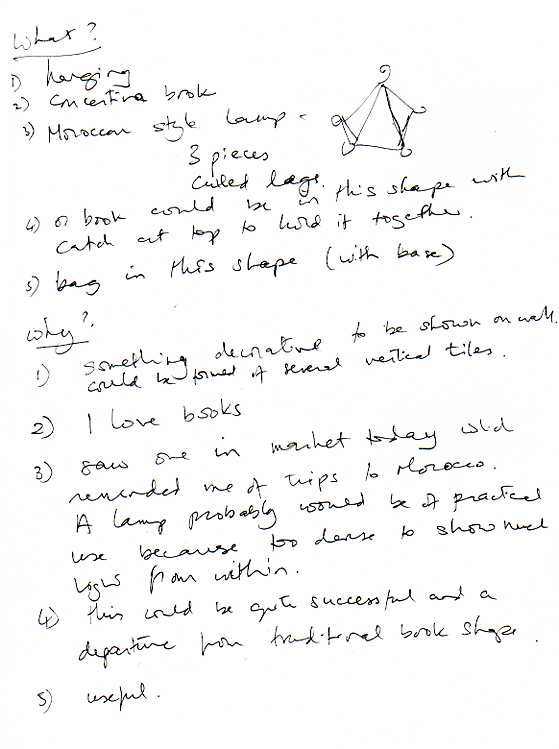
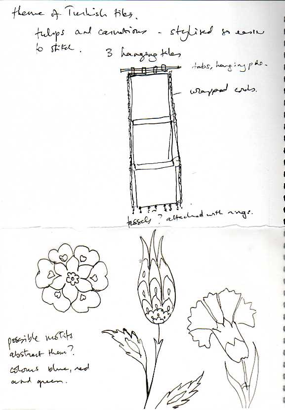
I think I have settled on the following format for my assessment piece. Some further thoughts:
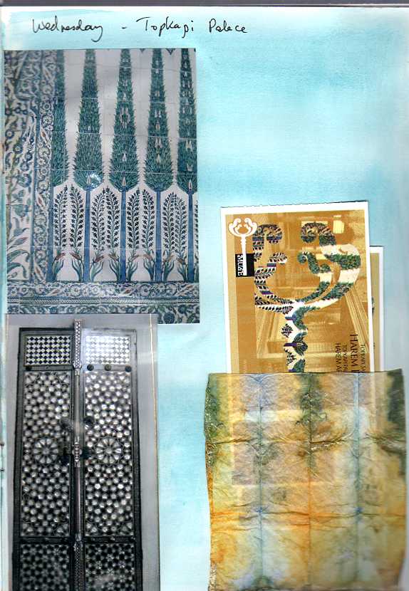
Pages from my Istanbul Journal March 2012:
More thoughts and experiments for the assessment piece.
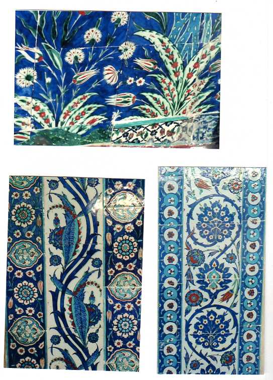
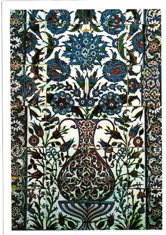
The plaque below really took my fancy. I think the borders could be interpreted by the wrapped cords and tassels.
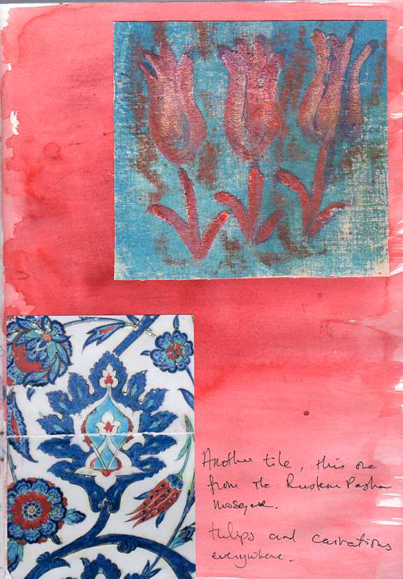
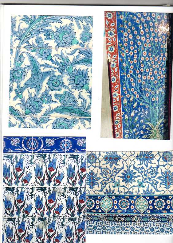
More examples of tiles:
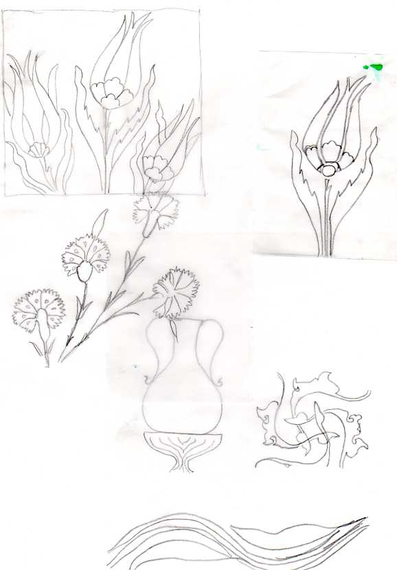
Enlargements of tulip and carnation:
Isolating possible patterns:
I like the idea of running patterns from one tile to another and will need to find ways of doing this.
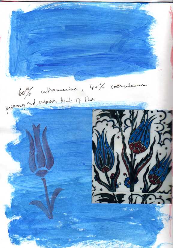
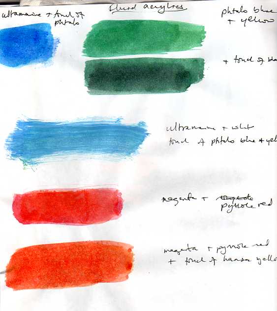
Colour swatches taken from tiles:
Idea for background:
Rough experiment to see how stitching worked on paper backed with calico.
Further thoughts:
November 12th
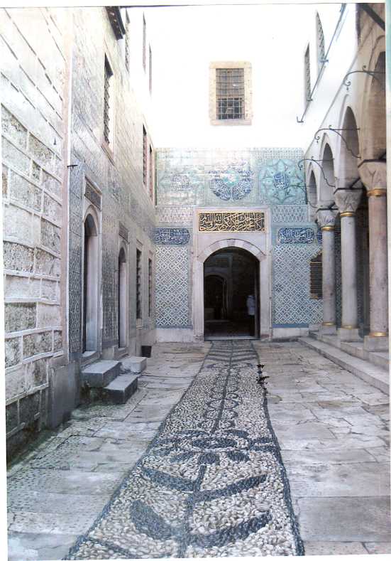
Some more pages from my Istanbul journal which could have a\ part to play in the finished piece: I loved these pebbles and the design they make; these and the mother of pearl shapes in the door could be expressed through granite stitch, using different coloured threads for the patterns.
My ideas so far for how the finished piece may look: I know this needs more precise detail both with regard to the design and to how I am going to put it all together.
Possible fabrics: That on the left ( whose colour echoes the surround of the plaque) is a heavy cotton with a slight pattern. The other three are furnishing fabrics with a heavy velvet like weave which I think could work well for the appliquéd tiles. I haven’t yet decided on the edging fabric.
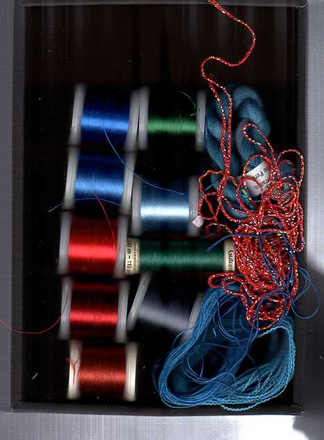
These are threads to sample.
November 14th
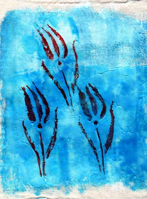
I’ve been doing a few experiments – callico with gesso applied unevenly with a large brush, then painted. The first uses a stencil – this wasn’t entirely successful as I’d made it too fine and had to use a fine brush to reach all areas – a stamp would probably work better. In the second I applied torn strips of paper with gel medium to the base. If the colours were less intense this might work as a background with stitching added.
I know these colours differ from the swatches of fabric above – I am still playing with ideas and actually did these experiments before I looked at fabrics, but just forgot to post them.
November 16th
Dividing the hanging vertically instead of horizontally. I’ve broken the lines of tiles and added the motif from the pebbles through the arches.
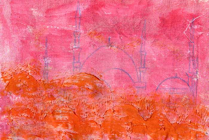
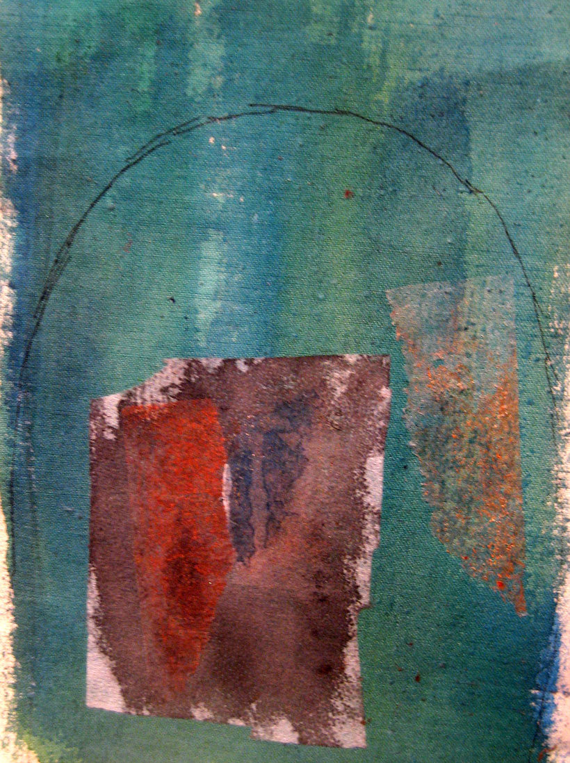
Another background experiment. Gesso, paint, moulding paste, paint with glazing medium. The image was originally a monoprint which didn’t work very well so I drew over the lines with an Inktense crayon.
November 18th
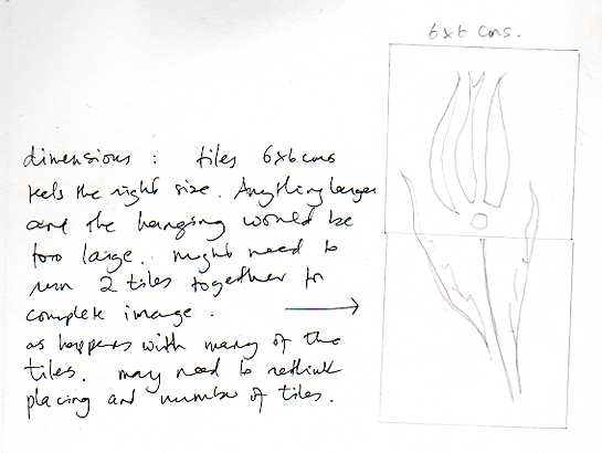
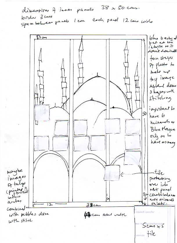
I did a mockup on a piece of board to see how dimensions would work. I’ve settled on a 5 cm square tile so as to give a bit of room for spacing and stitching down. Otherwise the work would be huge. It is big enough with the following dimensions! I’ve rewritten my notes on the sheet below as my writing is so tiny I think you might struggle.
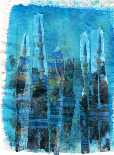
Blue background behind mosque but not too intense so it doesn’t dominate. Torn strips of photo (using several so I can place images exactly where I want them. Then use stitching and maybe crayon to complete shapes of the domes. Important to have 6 minarets as the Blue Mosque is the only one to have so many. I’m having to lose the mirror image of the mosque as it doesn’t fit into the design anymore.
Two tiles protrude into next panel which feels like a counterbalance to more minarets on the left. I’ve also lowered the position of the tiles slightly so as to take them away from the mid level.
In the arches maybe tulip images combined with pebbles done with stitch, or miniature domes to echo those above. I think the second idea is better – I can still use granite stitch for the pebbles idea.
One idea I have for background colour is to start with blue at the top behind the mosque and take it down to green at the bottom (symbolism – heaven to earth). I still want to use the furnishing fabrics for the tiles which behind the stitching will give some lighter contrast to the background. I see the stitching on the tiles as being mainly reds, blues and some metalic gold. I’m not sure yet about the background behind the tiles and in the ‘grouting’, but I feel it should enhance the idea of age and the way some tiles are missing, so maybe I could use a stencil in the shape of the tiles onto wet moulding paste with added stitch to bring out the shapes. I’ve carefully positioned the tiles so that there could be lost tiles in the gaps.
So the dimensions are: each panel 12 X 50 cms, space between each panel 1 cm, border 3 cms. I haven’t worked out the top and bottom edging yet, but I imagine they will be around 5 cms at their greatest depth. The dimensions of the piece excluding the top and bottom edgings are 44 X 56 cms. The border may need to be slightly wider, I’ll have to see once the panels are completed.
November 21st
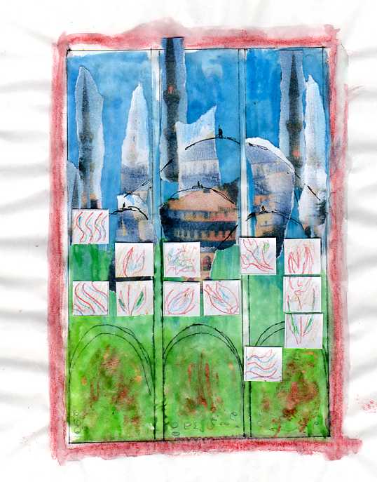
This is a very rough mock-up on A4 paper to test how it could look with regard to colour and composition. I’ve just stuck down the strips of paper for now rather than transfer them with gel medium. I want the minaret in the centre piece to go onto the border. I think that using some painted bondaweb inside the arches before stitching could be good. I haven’t quite got clear the design for this yet.
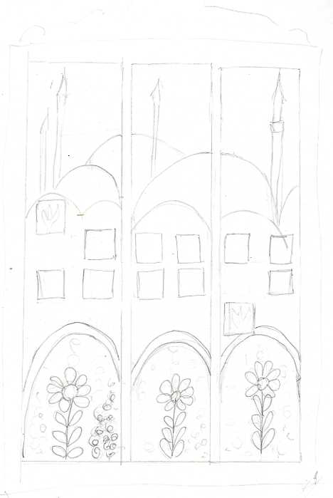
I’ve traced some rough ideas for the tile patterns below. The scanner hasn’t quite caught the top and bottom areas. The three edging tiles (2 on the left and the bottom one on the right) will be in the dark red furnishing fabric, the others beige/off-white.
November 27th Full size Mockups
This is a full size mockup on paper. I’ve decided to have a gentle haphazard move from blue to green, so as to avoid a line across. Rather than using long strips of photo, as I did in the original experiment (shown below), I’ve used fewer amd more randomly shaped pieces, mainly because I was worried about losing too much of the blue background, but I’m not sure it works as well. Apart from the stenciled tulip on the right (which I am not 100% sure about either), I’ve used the same design across the tiles and because most tiles are symmetrical in design I’ve placed them facing towards the centre. I’ve drawn a continuation of the tulip onto the missing tile area over the moulding paste though I haven’t tried stitching onto the paste(?) I’ve also changed the three red surround tiles to all have the same pattern.
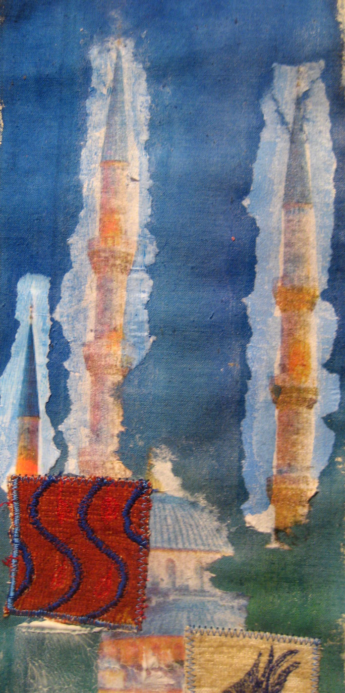
Full size mockup of one panel on callico
Here I have experimented with various techniques: The small minaret on the far left is the phot glued down with matte gel medium, the two others were laid down using the transfer method with the medium. I’m not sure which is the more successful , whether the transfer method gives an image which is too vague. Somehow this needs improving, there is something a bit stark about the shapes – they don’t blend in well enough.
I know the tiles are not quite straight and I have experimented with satin stitch and a longer zigzag around the edges. I think the latter looks better. You can’t really see the little red tulips, so I may add some metallic thread to these.
In the arch I experimented with painted bondaweb. On the left is added a piece of black painted fine stick on interfacing before the bondaweb, on the right the bondaweb is stuck straight down onto the painted callico. (Colour is not quite right in the detail below, veers to far to the reds).
With regard to construction, I will need to turn the inner edges of the panels to the back, probably just stuck down with bondaweb, whilst the outer edges will be stiitched to the borders. I will then back the whole piece with another piece of fabric, sewing three sides,turning it like a quilt and finishing the last side by hand. I’m undecided about the colour of the backing as a little will show between the panels. The top and bottom edging and the tassels will then be added.
I’ve just realised I haven’t tried stitching any pebbles in the arch, so need to try that.
