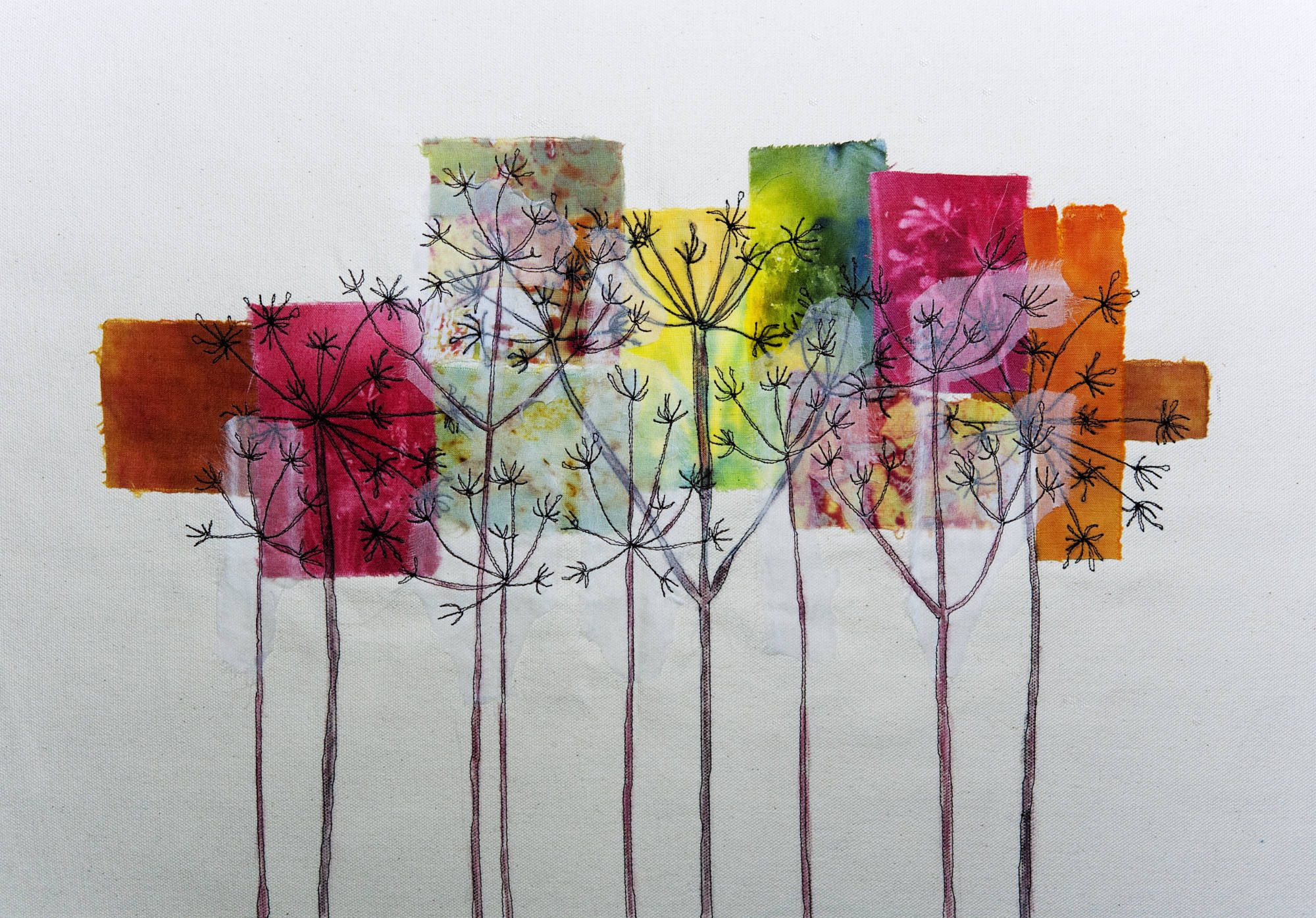
This module focusses on printing.
Leaf border
Here I added a border of leaves printed using compressed sponge to a previous painting of beech leaves. I think the border adds more interest to what was quite a stark page.

Leaf shapes
I cut positive and negative shapes out of the compressed sponge, printing on to a page covered in blue wash. I don’t feel this is totally successful – I don’t think the shapes are crisp enough to stand out from each other, or maybe the colours don’t contrast enough. After I had done it I thought I don’t like this and put it to one side, but I probably should experiment more. I love the effect the sponge gives.

Bottles
Positive and negative shapes overprinted with a smaller bottle shape, with some copper markel rubbed over some areas. As a patterned page I think this is quite effective.

More bottles
I’ve used a photograph I took at a friend’s house of these bottles on a windowsill. I’ve used a bit of gesso to soften the edges. A lino print on the right and I’ve used watercolour within the shpes. The pattern at the top is a wooden block print which I felt echoed the pattern in the net curtain and the sponge prints give a lightness to the solid forms above. I like the way the green bottle stands out and I had the idea to follow this up with something along the theme of ’10 green bottles’, but I haven’t yet worked out how to do it.

Jugs 1
This monoprint was done using method 2 on to tissue pape and I love the shapes formed by the paint touching the paper. There was too much white space in the middle jug so I added some blue oil pastel. The 2 jugs on the left are rubbings on tissue over textured jugs I had used on an earlier page, the smaller one darkened slightly with blue wash. I also darkened the wash around the base of the jugs so they wouldn’t look as though they were floating in space. I drew lavender type flowers and stems in the left and right jugs of the print though these are not very visible. I wasn’t sure if the border print was right to cover the little jug, but when I cut another jug shape and overlayed it, it looked worse so I have left it as is.

Jugs 2
This monprint was made using method 1 and just laying the tissue paper over the plate with no re-inking after the first print. The lines of the jugs were not strong enough, even after the orange wash, so I drew over these with pen. I had written a page with the words jug in different sizes, scanned and enlarged a section, cut this into strips, glued down on the right and overlayed with more jug rubbings. I felt the page didn’t need anymore colour adding to it.

Room with a view
May Hill is a landmark clearly visible from our house and at midsummer the sun sets more or less over it. Doing something with it has been simmering in the back of my mind as a project for some time. The photo is small but because of its intensity draws the eye immediately (I hope). I’ve used a monoprint of the view top right, with a sunset painted in and a lino print on tissue paper bottom left. Photocopied map, image and words complete the picture. A wash was selectively added afterwards, with acrylic gel and some salt crystals adding texture. I am pleased with the result.

My house
This is work in progress as it needs something to give it movement and energy but I am not sure what. I found a letter a friend had sent my mother just as I was about to move into this house. At first I just thought I would use it as I liked her handwriting but then noticed I could make something of the words themselves. I used the same phot as in the previous work, made a monoprint of the front of the house and these lie over a monoprint of abstracted plant stems. Along the top is a double print from the lino block. As it stands at the moment it is too monochrome.

Here is my take on ‘Ten Green Bottles’ :

I made some monoprints using two sheets of glass and twisting them round so as to get what I hope is a watery wave, droplet look. I stuck these down across the page, adding a light watercolour wash. The colour was a bit bright so I knocked it back with some watered down gesso. Then I added each bottle with just a strip of glue so they can be folded back. They are in order : 1) photo, 2) collaged monoprinted paper, 3) rubbed away graphite with added watercolour, 4) lino print, 5) collaged tissue paper that had been printed then rubbed over textured paper, 6) graphite rubbing over card with added watercolour, 7) monoprint, 8) oil pastel with watercolour, 9) collage, 10) graphitint pencil. There is a sponge print on the back of each which I wanted to be like an echo print. As you fold back each bottle you see the number (foam print) of the remaining bottles. Below is a patterned monoprint to represent the wall. Above is the rhyme itself. I know I have left one bottle standing so to speak but I feel this is graphically more satisfying. I was worried the bottles wouldn’t stand out enough against the background, but I didn’t want to lose the watery texture and I think in the end it works OK.

On reflection, I feel that the text pieces should be more muted so have added a wash to the images below. This is much better and looks more integrated.

