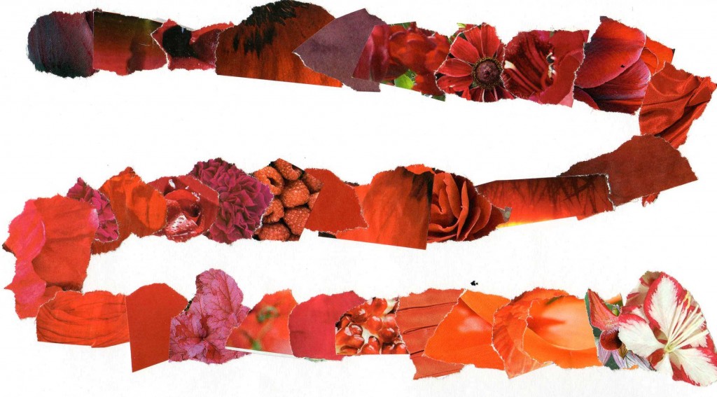
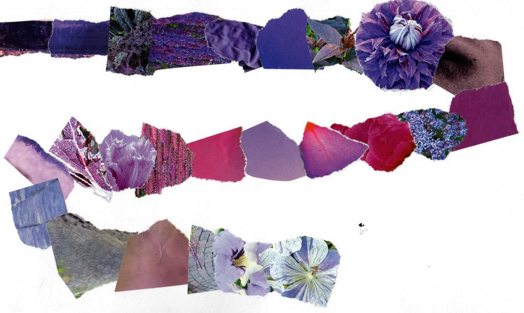
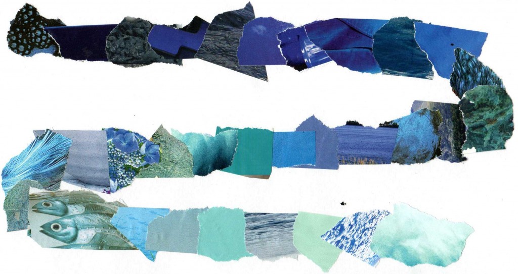
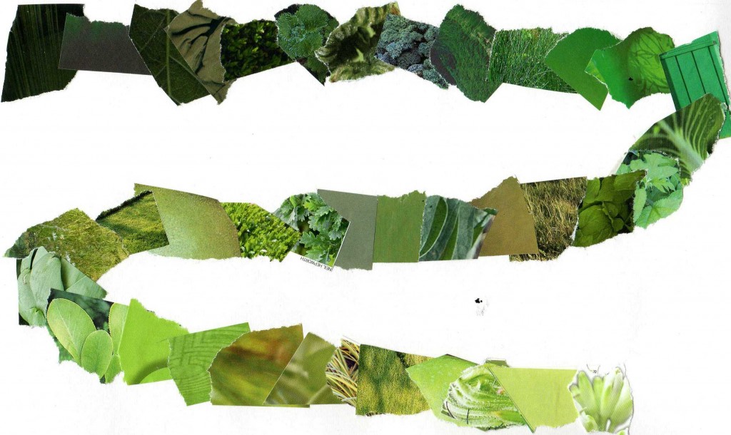
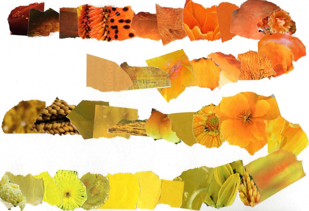
This was an interesting exercise which at first I felt I wanted to do as a continuous spiral from one colour into another, but I had too many pieces with too little space to really do this, so opted to do each colour seperately.
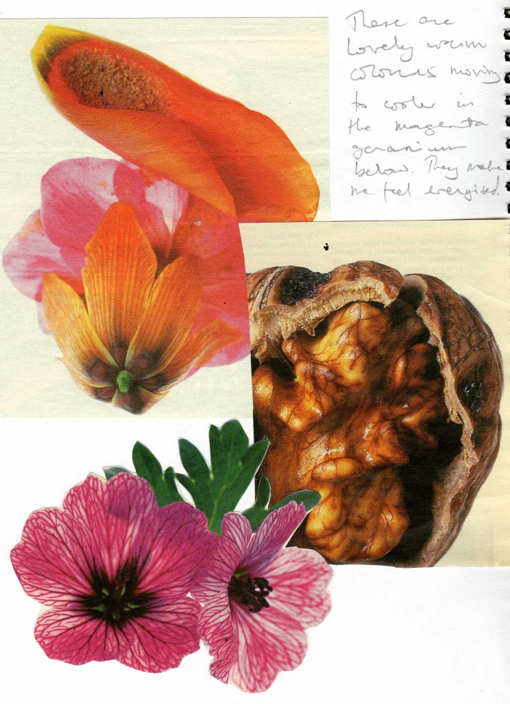
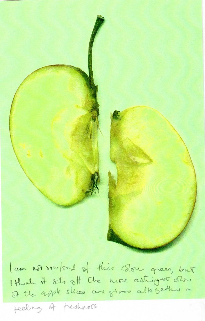
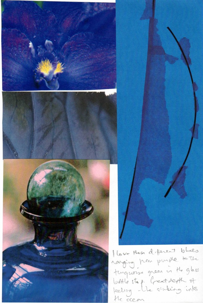
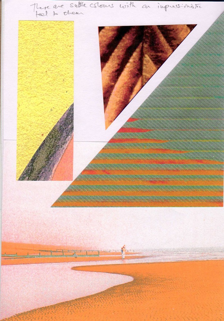
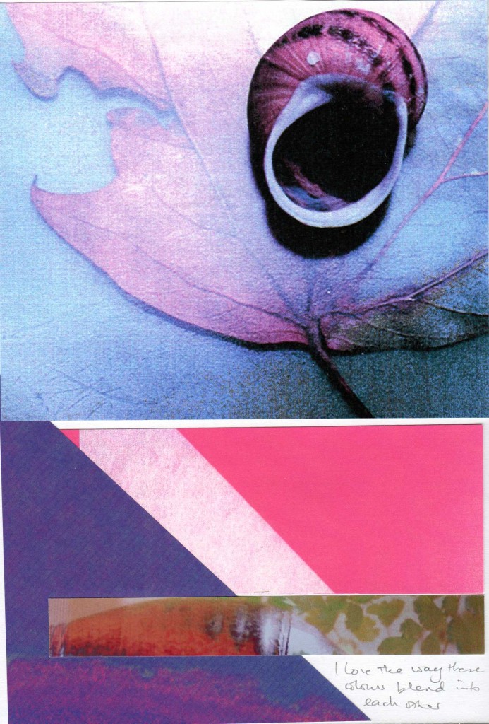
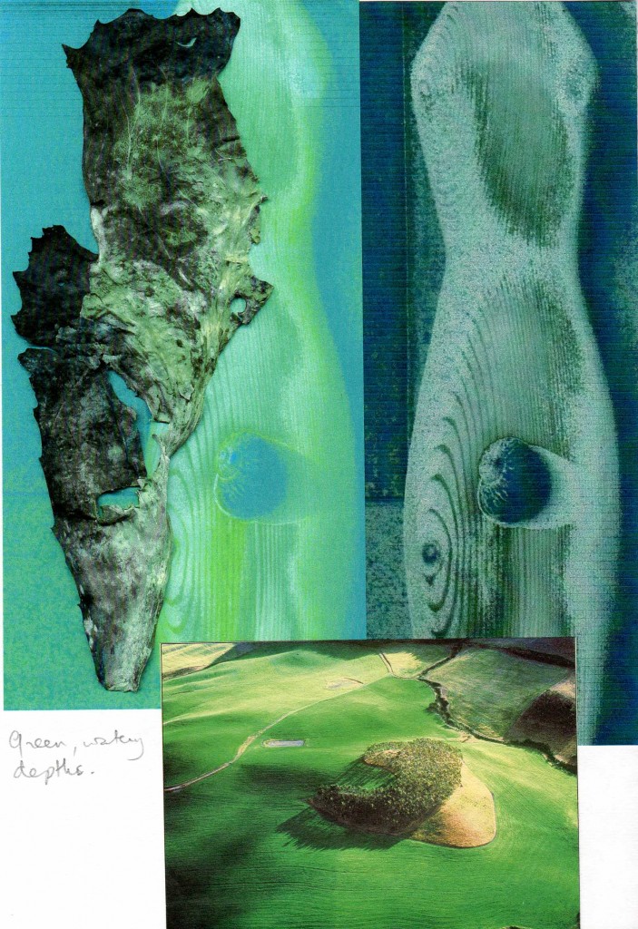
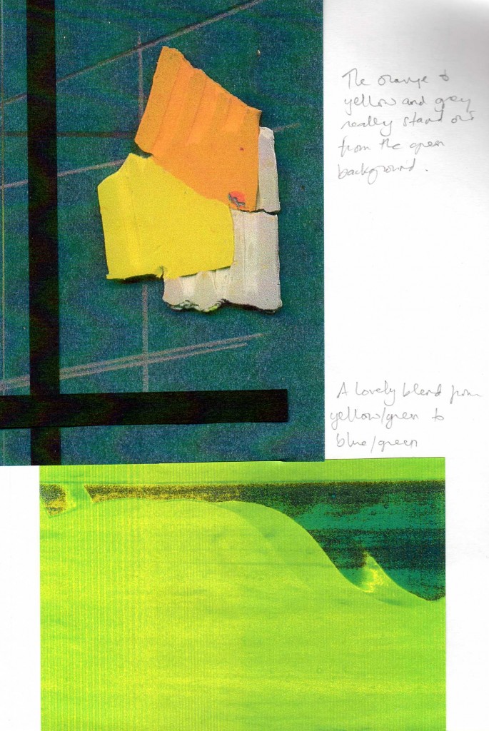
I love colour and am very aware of it. I notice that I am much more drawn to ‘broken’ colours – those that mix and meld and give subtle variations in colour and tone, especially the effect of light on colour. No doubt this comes from having trained as a photographer. I find primary colours somewhat stark and would always seek to alter them, so I imagine in stitch it would be a question of layering different tones of colour to break up the basic block, Nature very rarely gives us pure unadulerated blocks of colour. When I dye fabrics, I tend not to stir the solution too much so that I get some interesting results. I have a huge collection of pictures – photos, postcards etc in box files. (I am a terrible hoader of things that ‘might one day be useful’!) It was just a question of sorting through them to pick some out for my notebook.
I also have quite a collection of different fabrics including a lot I have dyed myself. One of my issues has been not knowing how to use the raw materials, so I am sure this course will assist me along this road! I have a lot os threads too and bought a load of rayon viscose threads in 1000m spools as I knew I would need a lot. They are 40s, but I do have some 30s as well.
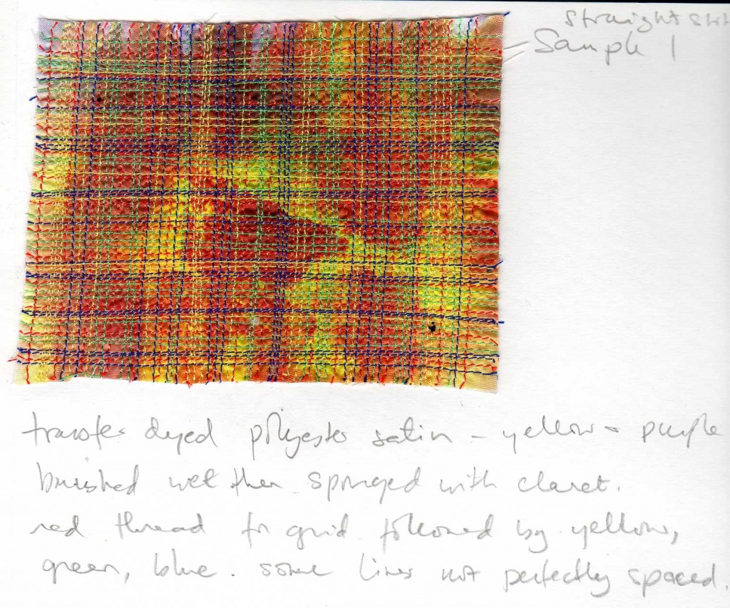
I have already worked with transfer dyes so did not do further experiments with these except as pieces to stitch.
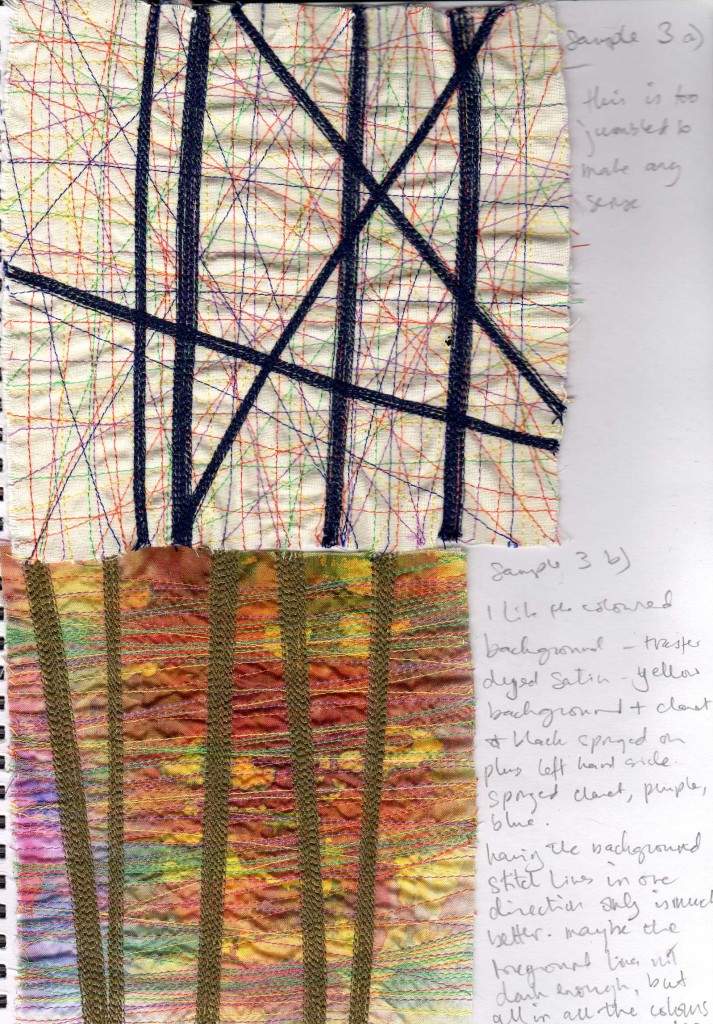
I really liked this last piece – there is a nice rippling texture to the background due to the interplay of satin fabric, the pattern of the dyes and the horizontal stitching, which draws the eye past the foreground vertical stitching. These two pieces show the difference between being totally haphazard and having some kind of structure.
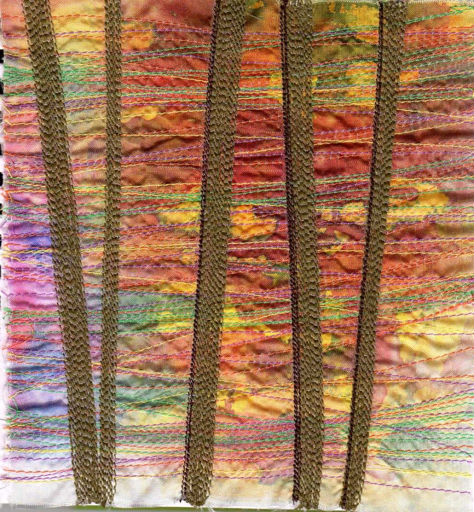
I think the addition of the dark line helps to give added dimension to the piece. I have left the two lines on the left as they were for comparison purposes.
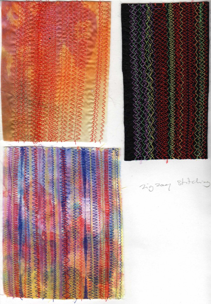
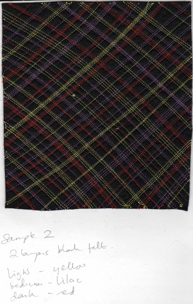
The black felt has a nappy liner backing. The satin pieces have vilene. The top one has claret, orange and yellow transfer paints brushed and sponged on. The bottom one is claret, purple and blue with added yellow and orange from another sheet on the lower area.
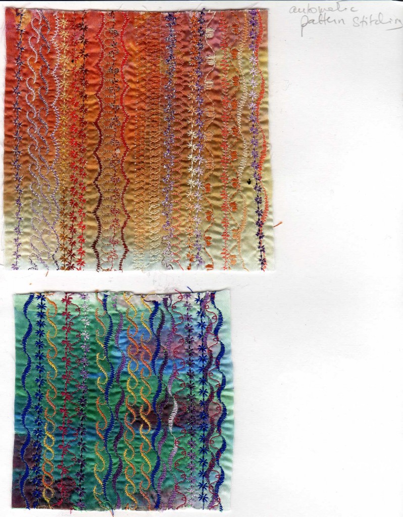
I’ve never used automatic patterns before and really enjoyed the exercise. I particularly liked the colours of the second piece. The top one has yellow, orange and claret transfer paints, brushed and sponged. The second has green and blue brushed, with blobs of claret.
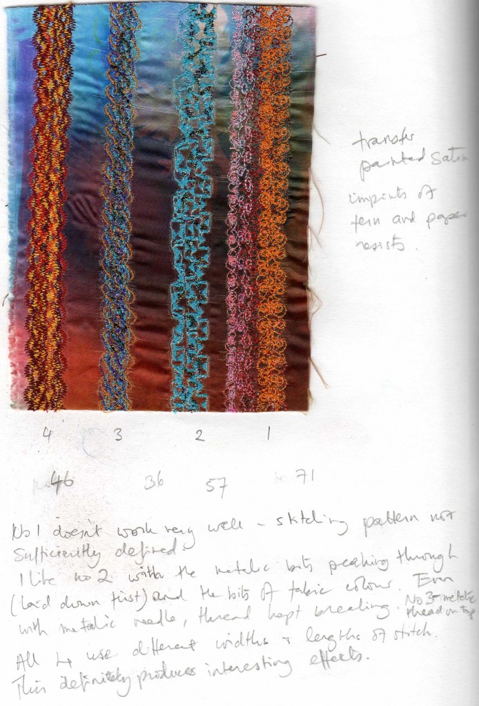

I decided to stitch a sample of all the patterns on my machine (of which this is a part) so as to have a better idea of how they would look.
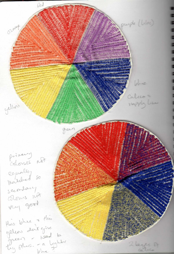
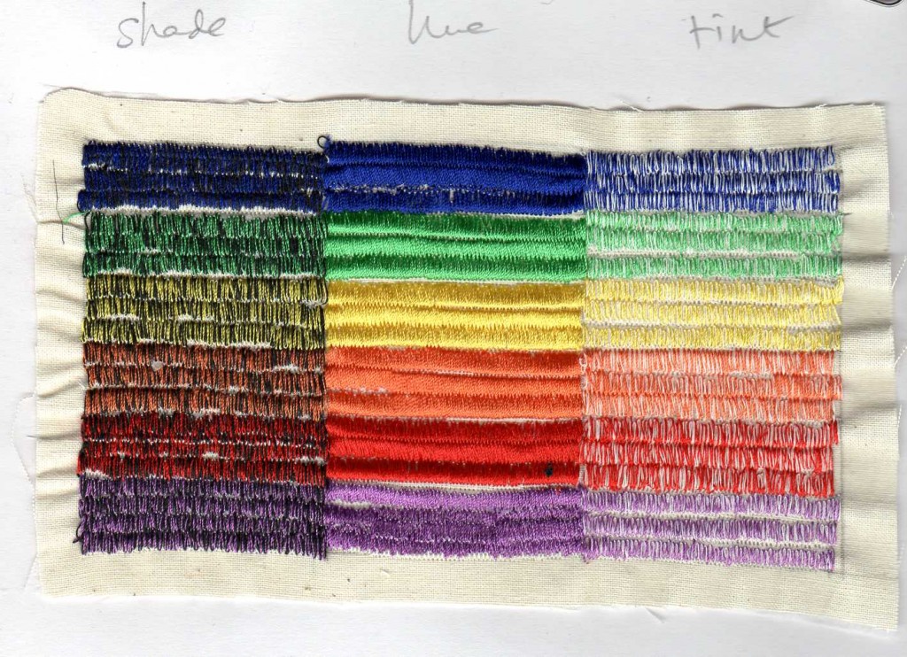
The first wheel uses the 3 primaries and 3 secondaries. , the second wheel uses the 3 primaries. I am aware that the colours I had are not perfect, but give me an idea of how stitched colours work together.
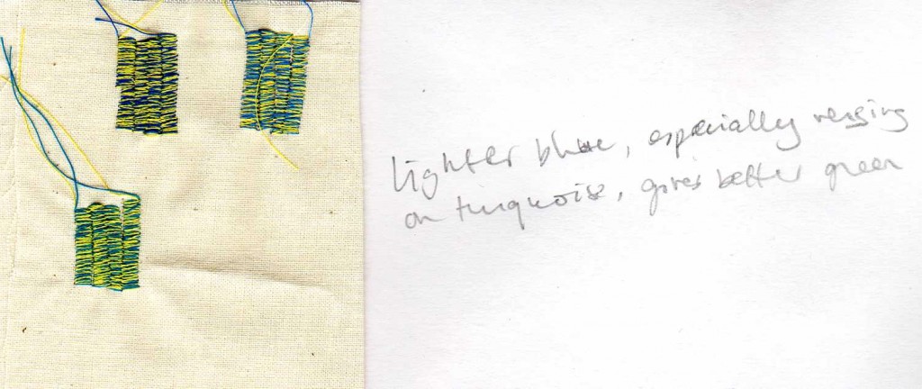
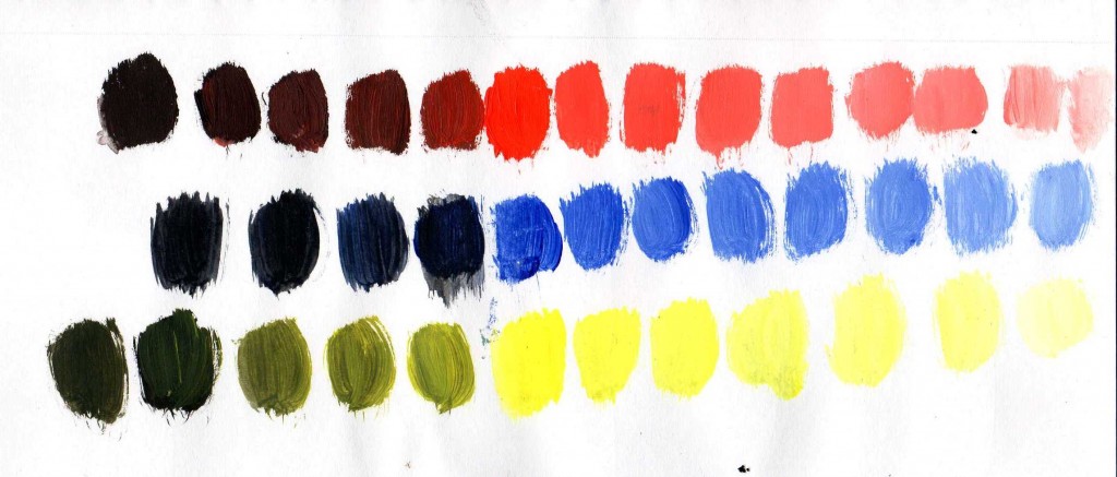
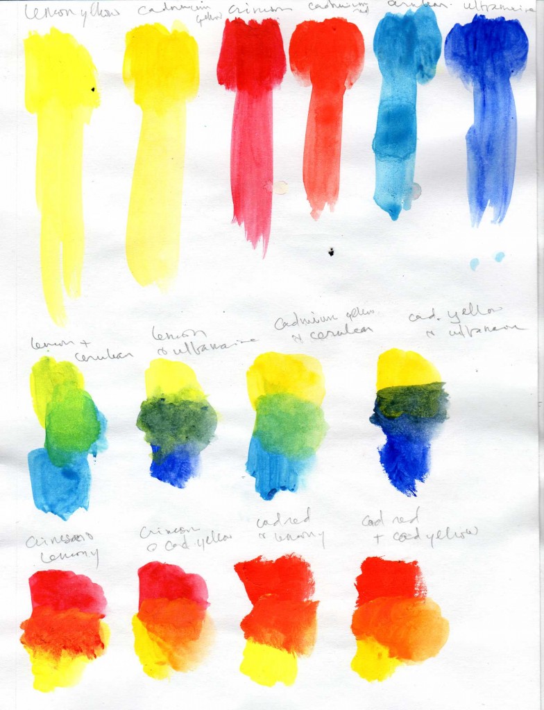
The next two images are exercises I did a while ago to show the difference between warm and cool colours.
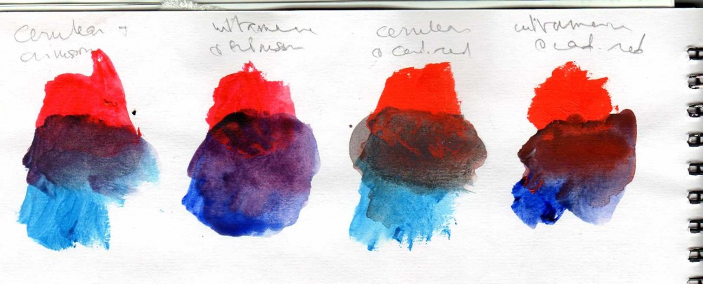
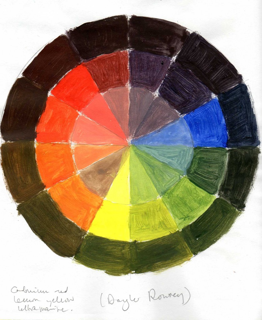
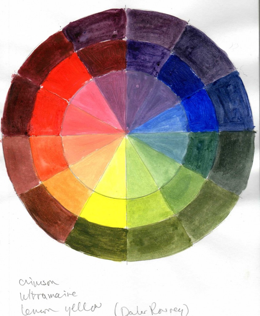
I decided the above colours didn’t work very well as adding black made the reds, purples and blues to muddy, so I used a crimson in the second wheel which worked better.
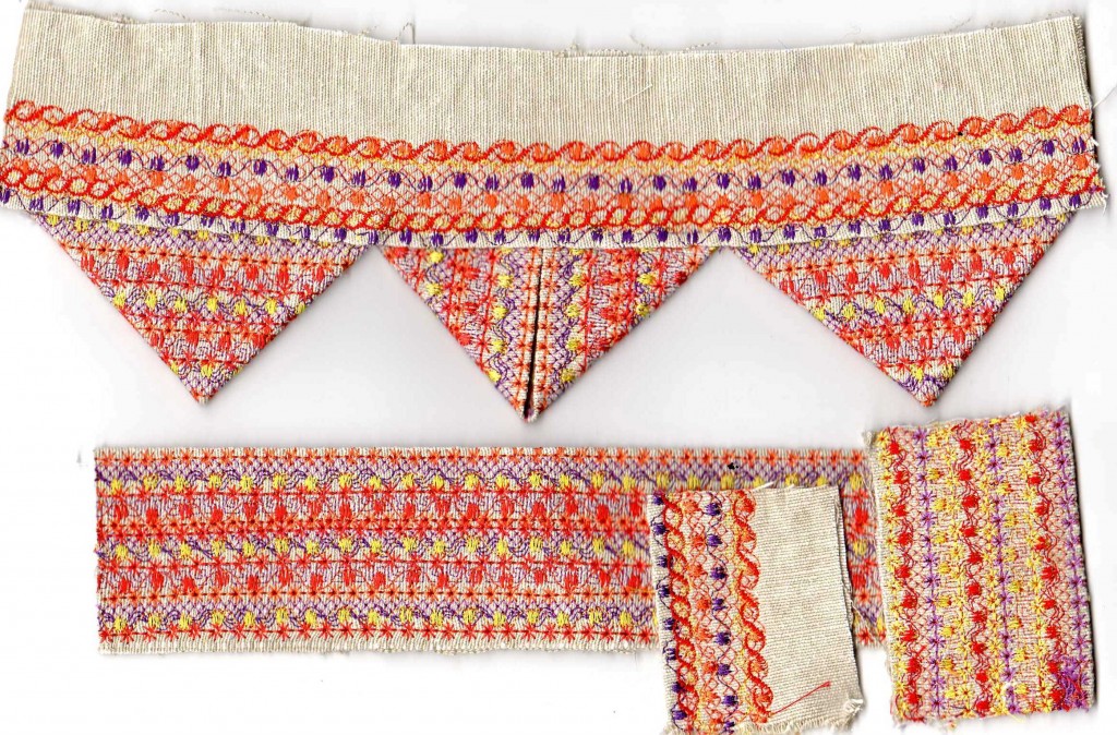
The above is my first prairie point sample, with a sample of the reverse pattern on the far right.
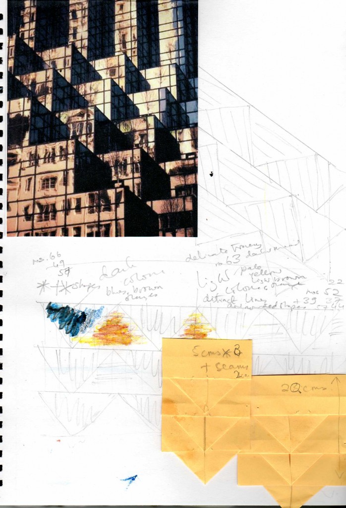
Trump Tower, New York (Tony Stone Images)
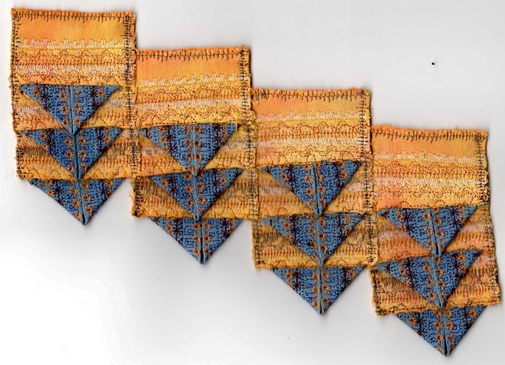
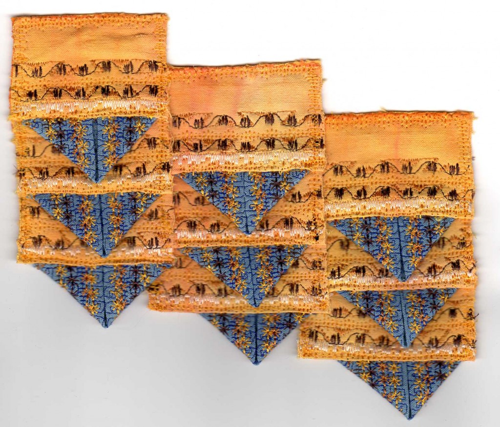
I found this image of shade and light on a building to use as my inspiration for my resolved prairie point sample. I soon realised it would be difficult to get the precise diagonal lines of the image with vertical and horizontal stitching. I was not satisfied with the first sample (and also felt that technically it was not good enough) but I altered the layering of the second sample and how I sewed it together. I feel it is better and demonstrates the original inspiration. The fabrics I used were pieces of hand-dyed sheeting I had left over from a quilting project.
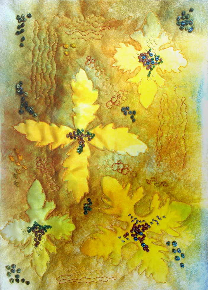
I used cut out paper shapes for the resists with lutradur as the top layer cut away to expose the under layer and used machine and hand stitching with wadding and a backing fabric.
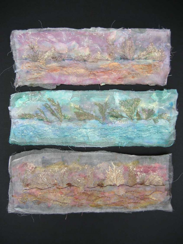
I did this at a summer school course in Oxford with Amanda Hislop. It is made up of layers of muslin and dyed and wetted papers, sandwiching pieces of plant material, dried and then machine stitched, finally rubbed in places with Markel paintsticks. The inspiration came from a photo of plane trees along the Canal du Midi I started working with, plus a photo of the bark and lichen on one tree which I flipped to echo the feel of the first photo.
