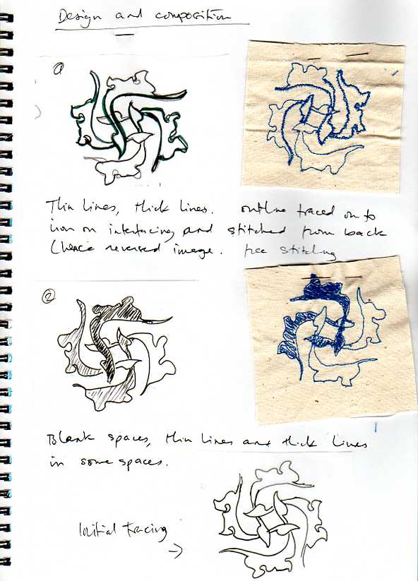
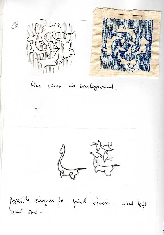
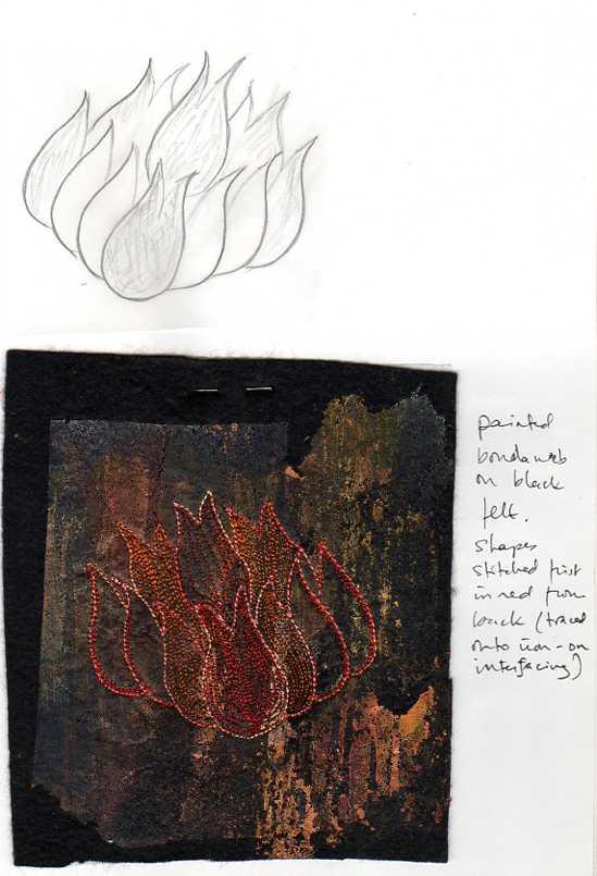
I used a motif from one of the tiles in my image bank for the assessment piece.
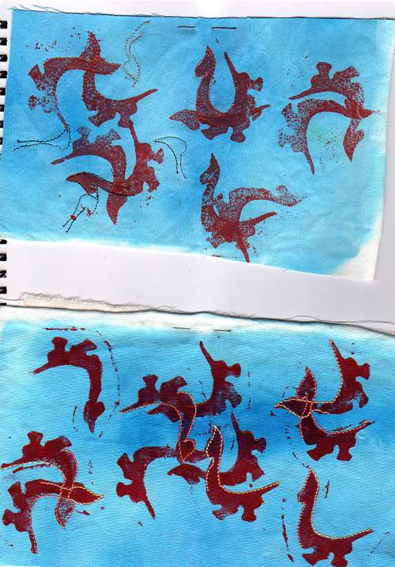
Foam print block
I don’t think my first attempt below works very well, the second is better.
Distorted images
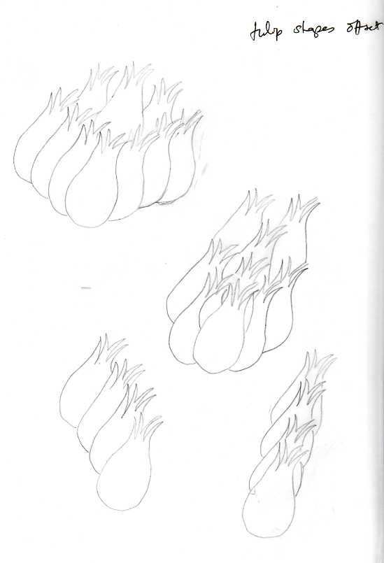
I used a tulip petal to play around with, drawing on to a pair of tights.
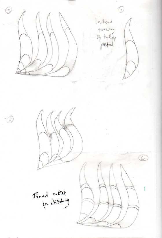
Expanding a motif
This is maybe a little dark and monotone in colour but I like the overall distressed look of the background which could resemble an old tile.
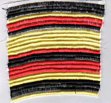
Colour
In the stitched samples above, the fuschia, no 3, is too dark, the one belowis more like the buddlia flowers in the image. I’ve left threads attached where I have used two in the needle so I can see what I used.
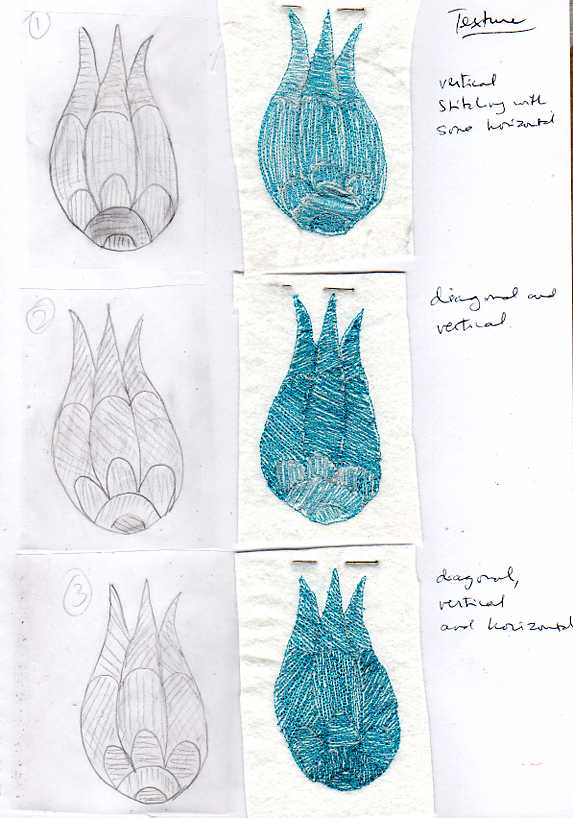
Texture
In the above piece I started off using white bobbinfill, but as this didn’t give a very good block of colour, I switched to using turquoise in the bobbin as well (halfway through sample 2).
Using these design ideas together
I took one section of the tulip petal and expanded it. The horizontal lines seemed to break up the image too much so I extended them across the whole piece.
The Fibonacci sequence
Three designs for hangings, using Golden Section focal points
