
Samples 1 and 2 – The colours are quite stark, with well defined lines. The narrow lines give more interest by breaking up the blocks of colour. 3 and 4 – The lighter touch of the automatic patterns gives a much more subtle effect.
The complementary colours in the lower sample are dynamic together, yet quite subtle. I like the way you can get one colour to dominate over the other depending on how you layer them and the different effects this can give.

Taking the bottom sample first, I like this effect. Even though I have used all three primaries and all three complementaries. the effect is actually quite subtle and interesting. There is a nice blending that is quite harmonious.
In the top sample, I used both one and two threads in the needle, depending on how I wanted one shade to flow into the next.


It was interesting doing the three samples. On the whole, I think the second one is the most successful, because of being able to create more subtlety of colour. I prefer the transfer dyed fabric to the black felt and the cwertical zigzag effect is better than the more horizontal lines.

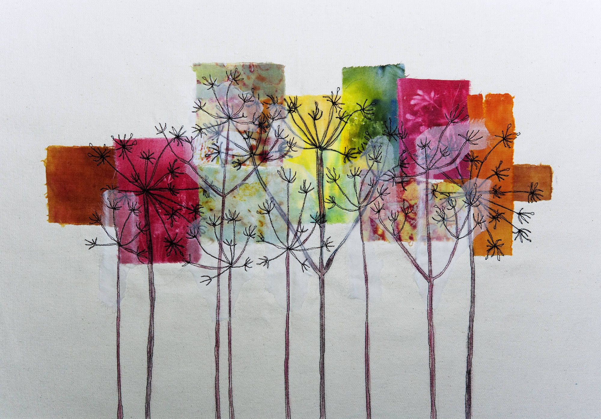
I felt inspired to make this quilt (45 X 42 cms), using mainly fabrics I dyed myself, plus indigo pieces dyed by a friend. I wanted to try quilting curved pieces which I had been reading about recently. I bondawebbed the additional pieces around the sides and at the top. The stitching is not perfect I know, but I really enjoyed making it and feel quite pleased with the results. I’ve added more purple, but I still feel it conveys the spirit of the painting.